I used to think architectural patterns were just decoration—pretty tiles slapped onto buildings to impress tourists.
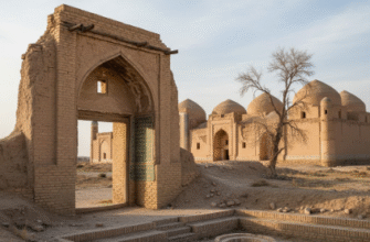
Turns out, Uzbek ornamental design is more like a visual language, one that’s been whispered across Central Asia for roughly a thousand years, give or take a few centuries. Every geometric shape, every arabesque curl, every color shift means something specific to the communities that built these structures. The artisans who carved intricate patterns into madrasas and mosques in Samarkand and Bukhiva weren’t just showing off technical skill—they were encoding religious devotion, cosmic order, mathematical principles, and social hierarchies into clay and tile. Walking through the Registan Square complex, I’ve felt this overwhelming sense that I’m missing an entire conversation happening in visual code above my head. The patterns aren’t random. They’re deliberate, referitive, sometimes contradictory, and always more complex than they first appear.
Here’s the thing: Islamic art traditionally avoids depicting living beings, so geometric abstraction became the primary vehicle for spiritual expression. The endless knot patterns—called girih—represent the infinite nature of Allah, loops that theoretically never end. I guess it makes sense that a faith centered on monotheistic infinity would develop art forms that literally have no beginning or endpoint.
Anyway, the color choices aren’t arbitrary either.
The Cosmic Blueprint Hidden in Ceramic Tiles and Brickwork Facades
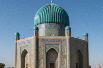
Uzbek artisans used a specific palette—cobalt blue, turquoise, white, yellow, sometimes green—and each carried symbolic weight. Blue represented heaven and spirituality, which explains why you see it dominating the domes and upper portions of sacred buildings. Turquoise symbolized water and life in a desert region where both were precious. White stood for purity, yellow for sunlight and earthly wealth. Walking through Khiva’s Ichon-Qala fortress, you notice how the colors shift depending on the building’s function—madrasas have different chromatic priorities than mausoleums, which differ from caravanserais.
The mathematics embedded in these patterns is honestly kind of staggering. Researchers have discovered that medieval Uzbek tile-work demonstrates understanding of quasicrystalline geometry—complex mathematical concepts that Western science didn’t formally describe until the 1970s. The artisans weren’t writing equations, obviously, but they were manipulating pentagon and decagon relationships in ways that create non-repeating patterns with five-fold symmetry. That’s not intuitive geometry. That’s sophisticated spatial reasoning developed through generations of trial, error, and probably some jealously guarded trade secrets.
When Floral Motifs Actually Represent Paradise Gardens and Spiritual Abundance
Wait—maybe I should back up.
Not all Uzbek ornament is geometric. There’s this whole parallel tradition of islimi, flowing vegetal designs that depict stylized flowers, vines, leaves, and occasionally fruits. These aren’t botanical illustrations, though. They’re abstracted references to the Islamic concept of paradise as an eternal garden. The Quran describes paradise with very specific imagery—flowing rivers, fruit-bearing trees, cool shade—and Uzbek artisans translated those descriptions into visual motifs that cover entire wall surfaces. The pomegranate shows up constantly, symbolizing fertility and abundance. Tulips appear in spring-themed compositions. Cypress trees, always pointing upward, represent eternity and the soul’s journey toward heaven.
I’ve seen these floral patterns interwoven with geometric frameworks in ways that shouldn’t work but somehow do—organic curves contained within rigid mathematical grids, chaos held by order. The aesthetic tension reflects a theological balance between divine transcendence (geometry, abstraction, infinity) and divine immanence (nature, growth, earthly beauty). It’s philosophy rendered in ceramic.
How Regional Variations Reveal Trade Routes and Dynastic Politics Across Silk Road Cities
Honestly, one of the most fascinating aspects is how patterns shift across different Uzbek cities, revealing distinct artistic schools and historical influences. Samarkand’s Timurid-era buildings favor densely packed geometric compositions with Arabic calligraphy integrated as structural elements. Bukhara’s ornament tends toward more restrained, elegant proportions with stronger emphasis on brickwork texture. Khiva developed its own distinctive style later, in the 18th-19th centuries, featuring brighter colors and bolder contrasts—almost garish compared to the subtle sophistication of earlier periods.
These variations weren’t accidents. They reflected which dynasties controlled which cities, which trade routes brought which influences, which master craftsmen trained which apprentices. When the Mongols swept through Central Asia in the 13th century, they brought Chinese decorative motifs—cloud bands, dragon imagery—that got absorbed and reinterpreted through Islamic aesthetic principles. Persian influences flowed constantly from the west. Turkish traditions entered from the northwest. The ornamental vocabulary of Uzbek architecture is basically a visual record of Silk Road cultural exchange, frozen in tilework.
I guess what strikes me most is the intentionality. Every curve, every color transition, every symmetry break was a choice made by someone whose name we’ll never know, working within strict religious and aesthetic constraints but still finding room for creativity, regional identity, and personal expression. We tend to see historical Islamic art as monolithic, but spend enough time studying these patterns and you start recognizing individual hands, local preferences, moments when an artisan decided to bend the rules just slightly. The patterns aren’t just beautiful—they’re conversations across centuries, arguments about the best way to represent the divine, love letters to geometry, and very human attempts to create something permanent in a world that kept getting destroyed by conquest, earthquake, and time.